Block: Gallery
Gallery blocks have two settings: the number of columns, and whether or not images should be cropped. The default number of columns is three, and the maximum number of columns is eight.
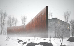
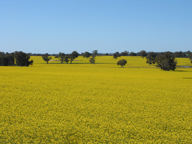
Below is a three column gallery at full width, with cropped images.
-
Lorem ipsum dolor sit amet, consectetuer adipiscing elit. Donec mollis. Quisque convallis libero in sapien pharetra tincidunt. Aliquam elit ante, malesuada id, tempor eu, gravida id, odio. Maecenas suscipit, risus et eleifend imperdiet, nisi orci ullamcorper massa, et adipiscing orci velit quis magna. -

Sunburst over the Clinch River, Southwest Virginia. -
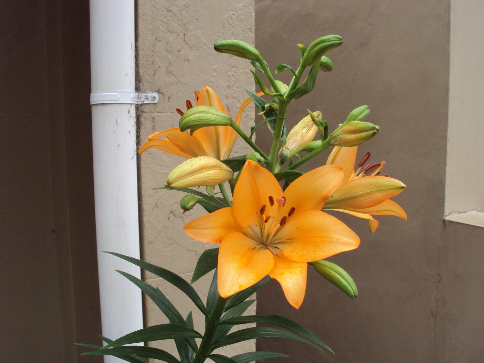
Orange Iris -

Boardwalk at Westport, WA -

Bell on wharf in San Francisco -

Coastline in Huatulco, Oaxaca, Mexico
Some more text for taking up space.
A two column gallery, aligned to the left, linked to media file.
In the editor, the image captions can be edited directly by clicking on the text.
If the number of images cannot be divided into the number of columns you have selected, the default is to have the last image(s) automatically stretch to the width of your gallery.
A four column gallery with a wide width:
-

-

-

Sunrise over the coast in Huatulco, Oaxaca, Mexico -

Lorem ipsum dolor sit amet, consectetuer adipiscing elit. Donec mollis. Quisque convallis libero in sapien pharetra tincidunt. Aliquam elit ante, malesuada id, tempor eu, gravida id, odio. Maecenas suscipit, risus et eleifend imperdiet, nisi orci ullamcorper massa, et adipiscing orci velit quis magna. -

-
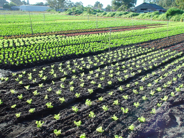
A five column gallery with normal images:
This is the same gallery, but with cropped images.
Six columns: does it work at all window sizes?
-

Boardwalk at Westport, WA -

Golden Gate Bridge -

Sydney Harbor Bridge -

Bell on wharf in San Francisco -

Rusty rails with fishplate, Kojonup -

Boats and reflections, Royal Perth Yacht Club -

Antique farm machinery, Mount Barker Museum, Western Australia -
-

Raindrop ripples on a pond -

Albany wind-farm against the sunset, Western Australia -

Lorem ipsum dolor sit amet, consectetuer adipiscing elit. Donec mollis. Quisque convallis libero in sapien pharetra tincidunt. Aliquam elit ante, malesuada id, tempor eu, gravida id, odio. Maecenas suscipit, risus et eleifend imperdiet, nisi orci ullamcorper massa, et adipiscing orci velit quis magna. -

Windmill shrouded in fog at a farm outside of Walker, Iowa -

Jericoacoara Ceara Brasil -

Sunrise over the coast in Huatulco, Oaxaca, Mexico
Seven columns: how does this look on a narrow window?
-

-

-

-

-

It’s dangerous to go alone! Take this. -

-

-

-

-

Boat BW PB Barco Texture Beautiful Fishing -

Coastline in Huatulco, Oaxaca, Mexico -

Jericoacoara Ceara Brasil -

Sunrise over the coast in Huatulco, Oaxaca, Mexico -

Beach at Big Sur, CA -

Windmill shrouded in fog at a farm outside of Walker, Iowa -

Sea and rocks, Plimmerton, New Zealand -

Rusty rails with fishplate, Kojonup
Eight columns:
-

Lorem ipsum dolor sit amet, consectetuer adipiscing elit. Donec mollis. Quisque convallis libero in sapien pharetra tincidunt. Aliquam elit ante, malesuada id, tempor eu, gravida id, odio. Maecenas suscipit, risus et eleifend imperdiet, nisi orci ullamcorper massa, et adipiscing orci velit quis magna. -

Boardwalk at Westport, WA -

Golden Gate Bridge -

Antique farm machinery, Mount Barker Museum, Western Australia -

Orange Iris -

Albany wind-farm against the sunset, Western Australia -

Bell on wharf in San Francisco -

Sydney Harbor Bridge -

-

Raindrop ripples on a pond -

-

-

Boat BW PB Barco Texture Beautiful Fishing -

-

Boats and reflections, Royal Perth Yacht Club -

Rusty rails with fishplate, Kojonup -

Sea and rocks, Plimmerton, New Zealand -

Coastline in Huatulco, Oaxaca, Mexico -

-

Block: Columns
This page tests how the theme displays the columns block. The first block tests a two column block with paragraphs.
This is the second column. It should align next to the first column. Reduce the browser window width to test the responsiveness.
This is the second column block. It has 3 columns.
Paragraph 2 is in the middle.
Paragraph 3 is in the last column.
The third column block has 4 columns. Make sure that all the text is visible and that it is not cut off.
Now the columns are getting narrower.
The margins between the columns should be wide enough,
so that the content of the columns does not run into or overlap each other.
Column one.
Column two.
Column three.
Column four.
Column five.
To change the number of columns, select the column block to open the settings panel. You can show up to 6 columns. If the theme has support for wide align, you can also set the alignments to wide and full width.
Below is a column block with six columns, and no alignment:
Column one.
Column two.
Column three.
Column four.
Column five.
Column six.
Next is a 3 column block, with a wide alignment:
Column one.
Column two.
Column three.
And here is a two column block with full width, and a longer text. Make sure that the text wraps correctly.
This is column one. Sometimes, you may want to use columns to display a larger text, so, lets add some more words. Lorem ipsum dolor sit amet, consectetuer adipiscing elit. Donec mollis. Quisque convallis libero in sapien pharetra tincidunt. Aliquam elit ante, malesuada id, tempor eu, gravida id, odio. Maecenas suscipit, risus et eleifend imperdiet, nisi orci ullamcorper massa, et adipiscing orci velit quis magna. Praesent sit amet ligula id orci venenatis auctor. Phasellus porttitor, metus non tincidunt dapibus, orci pede pretium neque, sit amet adipiscing ipsum lectus et libero. Aenean bibendum. Curabitur mattis quam id urna. Vivamus dui. Donec nonummy lacinia lorem. Cras risus arcu, sodales ac, ultrices ac, mollis quis, justo. Sed a libero. Quisque risus erat, posuere at, tristique non, lacinia quis, eros.
Column two. Cras volutpat, lacus quis semper pharetra, nisi enim dignissim est, et sollicitudin quam ipsum vel mi. Sed commodo urna ac urna. Nullam eu tortor. Curabitur sodales scelerisque magna. Donec ultricies tristique pede. Nullam libero. Nam sollicitudin felis vel metus. Nullam posuere molestie metus. Nullam molestie, nunc id suscipit rhoncus, felis mi vulputate lacus, a ultrices tortor dolor eget augue. Aenean ultricies felis ut turpis. Lorem ipsum dolor sit amet, consectetuer adipiscing elit. Suspendisse placerat tellus ac nulla. Proin adipiscing sem ac risus. Maecenas nisi. Cras semper.
We can also add blocks inside columns:
- This is a numbered list,
- inside a 3 column block
- with a wide alignment.
The middle column has a paragraph with an image block below.

-This third column has a quote
Theme Reviewer
But wait there is more! We also have a block called Media & Text, which is a two column block that helps you display media and text content next to each other, without having to first setup a column block:

Media & Text
A paragraph block sits ready to be used, below your headline.


