Block: Image
Welcome to image alignment! If you recognize this post, it is because these are blocks that have been converted from the classic Markup: Image Alignment post. The best way to demonstrate the ebb and flow of the various image positioning options is to nestle them snuggly among an ocean of words. Grab a paddle and let's get started. Be sure to try it in RTL mode. Left should stay left and right should stay right for both reading directions.
On the topic of alignment, it should be noted that users can choose from the options of None, Left, Right, and Center. If the theme has added support for align wide, images can also be wide and full width. Be sure to test this page in RTL mode.
In addition, they also get the options of the image dimensions 25%, 50%, 75%, 100% or a set width and height.

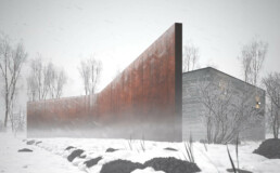
The image above happens to be centered.
The rest of this paragraph is filler for the sake of seeing the text wrap around the 150x150 image, which is left aligned.
As you can see the should be some space above, below, and to the right of the image. The text should not be creeping on the image. Creeping is just not right. Images need breathing room too. Let them speak like you words. Let them do their jobs without any hassle from the text. In about one more sentence here, we'll see that the text moves from the right of the image down below the image in seamless transition. Again, letting the do it's thang. Mission accomplished!
And now for a massively large image. It also has no alignment.
The image above, though 1200px wide, should not overflow the content area. It should remain contained with no visible disruption to the flow of content.
And now we're going to shift things to the right align. Again, there should be plenty of room above, below, and to the left of the image. Just look at him there… Hey guy! Way to rock that right side. I don't care what the left aligned image says, you look great. Don't let anyone else tell you differently.
In just a bit here, you should see the text start to wrap below the right aligned image and settle in nicely. There should still be plenty of room and everything should be sitting pretty. Yeah… Just like that. It never felt so good to be right.
And just when you thought we were done, we're going to do them all over again with captions!

The image above happens to be centered. The caption also has a link in it, just to see if it does anything funky.

The rest of this paragraph is filler for the sake of seeing the text wrap around the 150x150 image, which is left aligned.
As you can see the should be some space above, below, and to the right of the image. The text should not be creeping on the image. Creeping is just not right. Images need breathing room too. Let them speak like you words. Let them do their jobs without any hassle from the text. In about one more sentence here, we'll see that the text moves from the right of the image down below the image in seamless transition. Again, letting the do it's thang. Mission accomplished!
And now for a massively large image. It also has no alignment.

The image above, though 1200px wide, should not overflow the content area. It should remain contained with no visible disruption to the flow of content.

And now we're going to shift things to the right align. Again, there should be plenty of room above, below, and to the left of the image. Just look at him there… Hey guy! Way to rock that right side. I don't care what the left aligned image says, you look great. Don't let anyone else tell you differently.
In just a bit here, you should see the text start to wrap below the right aligned image and settle in nicely. There should still be plenty of room and everything should be sitting pretty. Yeah… Just like that. It never felt so good to be right.
Imagine that we would find a use for the extra wide image! This image has the wide width alignment:

Can we go bigger? This image has the full width alignment:

And that's a wrap, yo! You survived the tumultuous waters of alignment. Image alignment achievement unlocked! One last thing: The last item in this post's content is a thumbnail floated right. Make sure any elements after the content are clearing properly.
Block: Button
Button blocks are not semantically buttons, but links inside a styled div.
If you do not add a link, a link tag without an anchor will be used.
Check to make sure that the text wraps correctly when the button has more than one line of text, and when it is extra long.
Buttons have three styles:
If the theme has a custom color palette, test that background color and text color settings work correctly.
Now lets test how buttons display together with large texts.
Lorem ipsum dolor sit amet, consectetuer adipiscing elit. Donec mollis. Quisque convallis libero in sapien pharetra tincidunt. Aliquam elit ante, malesuada id, tempor eu, gravida id, odio.
Maecenas suscipit, risus et eleifend imperdiet, nisi orci ullamcorper massa, et adipiscing orci velit quis magna. Praesent sit amet ligula id orci venenatis auctor. Phasellus porttitor, metus non tincidunt dapibus, orci pede pretium neque, sit amet adipiscing ipsum lectus et libero. Aenean bibendum. Curabitur mattis quam id urna.
Vivamus dui. Donec nonummy lacinia lorem. Cras risus arcu, sodales ac, ultrices ac, mollis quis, justo. Sed a libero. Quisque risus erat, posuere at, tristique non, lacinia quis, eros.
Block: Cover
This is a left aligned cover block with a background image.
The cover block lets you add text on top of images or videos.
This blocktype has several alignment options, and you can also align or center the text inside the block.
The background image can be fixed and you can change its opacity and add an overlay color.
Make sure that the text wraps correctly over the image, and that text markup and alignments are working.
The next image should have a pink overlay color, the text should be bold and aligned to the left:
A center aligned cover image block, with a left aligned text.
This is a full width cover block with a fixed background image with a 20% opacity.
Make sure that all the text is readable.
Our last cover image block has a wide width.
This is a wide cover block with a video background.
Compare the video and image blocks.
This block is centered.
The block below has no alignment, and the text is a link. Overlay colors must also work with video backgrounds.
Block: Gallery
Gallery blocks have two settings: the number of columns, and whether or not images should be cropped. The default number of columns is three, and the maximum number of columns is eight.
Below is a three column gallery at full width, with cropped images.
-
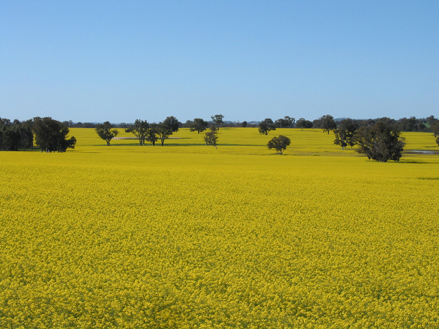
Lorem ipsum dolor sit amet, consectetuer adipiscing elit. Donec mollis. Quisque convallis libero in sapien pharetra tincidunt. Aliquam elit ante, malesuada id, tempor eu, gravida id, odio. Maecenas suscipit, risus et eleifend imperdiet, nisi orci ullamcorper massa, et adipiscing orci velit quis magna. -

Sunburst over the Clinch River, Southwest Virginia. -
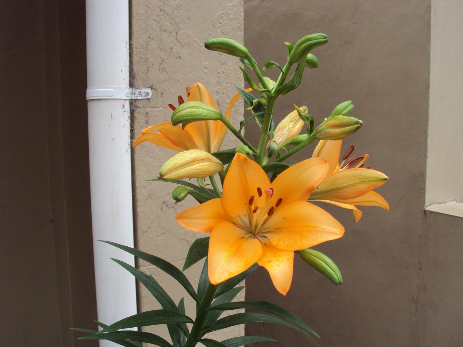
Orange Iris -
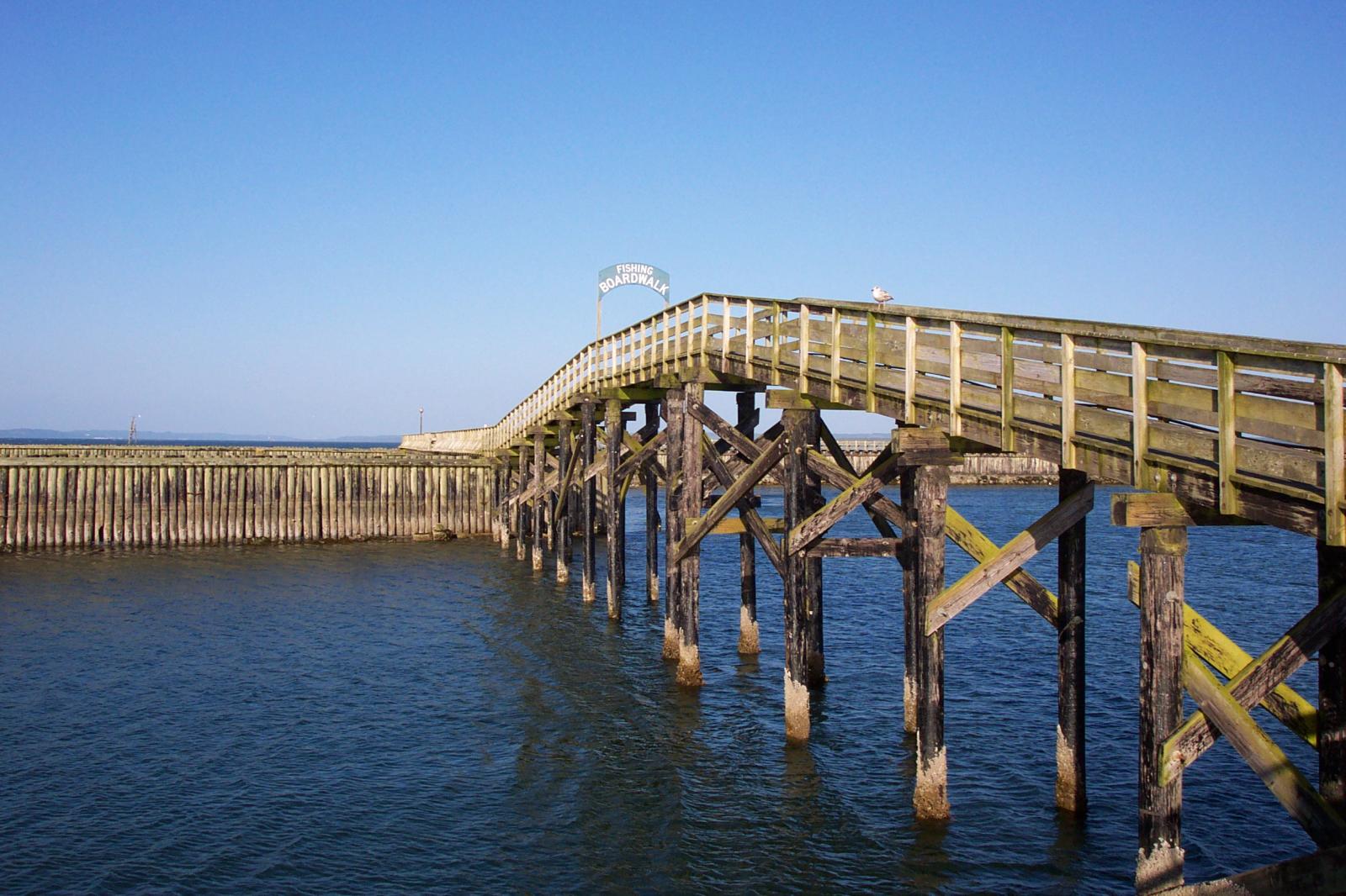
Boardwalk at Westport, WA -
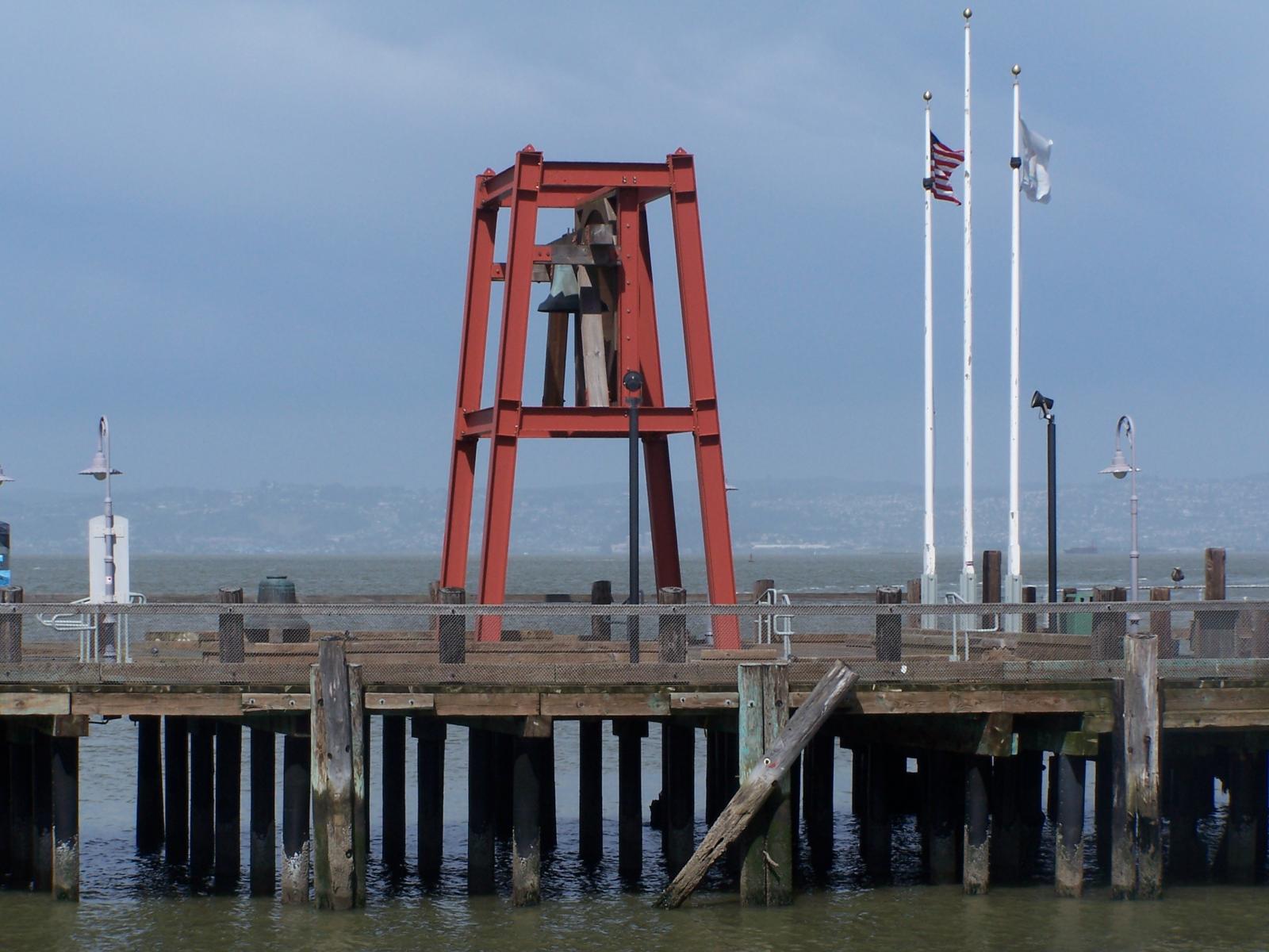
Bell on wharf in San Francisco -

Coastline in Huatulco, Oaxaca, Mexico
Some more text for taking up space.
A two column gallery, aligned to the left, linked to media file.
In the editor, the image captions can be edited directly by clicking on the text.
If the number of images cannot be divided into the number of columns you have selected, the default is to have the last image(s) automatically stretch to the width of your gallery.
A four column gallery with a wide width:
-

-

-

Sunrise over the coast in Huatulco, Oaxaca, Mexico -

Lorem ipsum dolor sit amet, consectetuer adipiscing elit. Donec mollis. Quisque convallis libero in sapien pharetra tincidunt. Aliquam elit ante, malesuada id, tempor eu, gravida id, odio. Maecenas suscipit, risus et eleifend imperdiet, nisi orci ullamcorper massa, et adipiscing orci velit quis magna. -
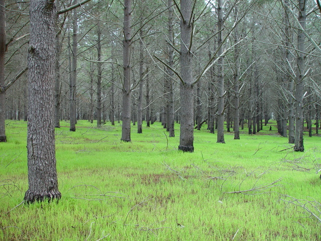
-

A five column gallery with normal images:
This is the same gallery, but with cropped images.
Six columns: does it work at all window sizes?
-

Boardwalk at Westport, WA -

Golden Gate Bridge -
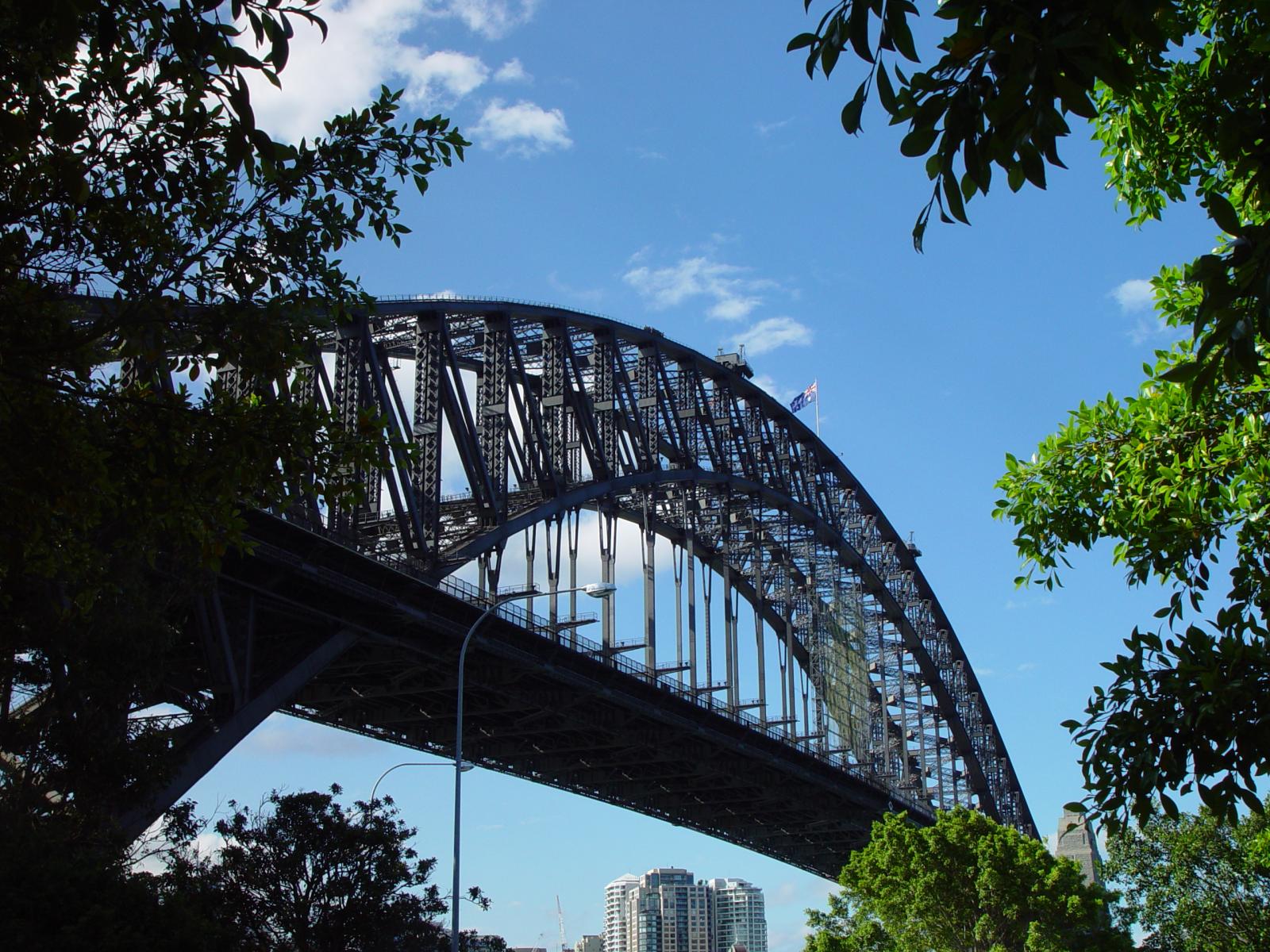
Sydney Harbor Bridge -

Bell on wharf in San Francisco -

Rusty rails with fishplate, Kojonup -
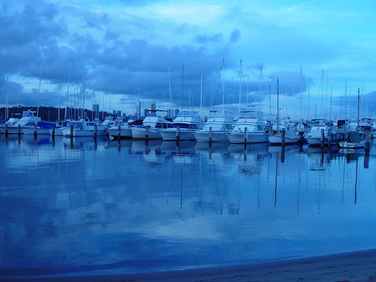
Boats and reflections, Royal Perth Yacht Club -
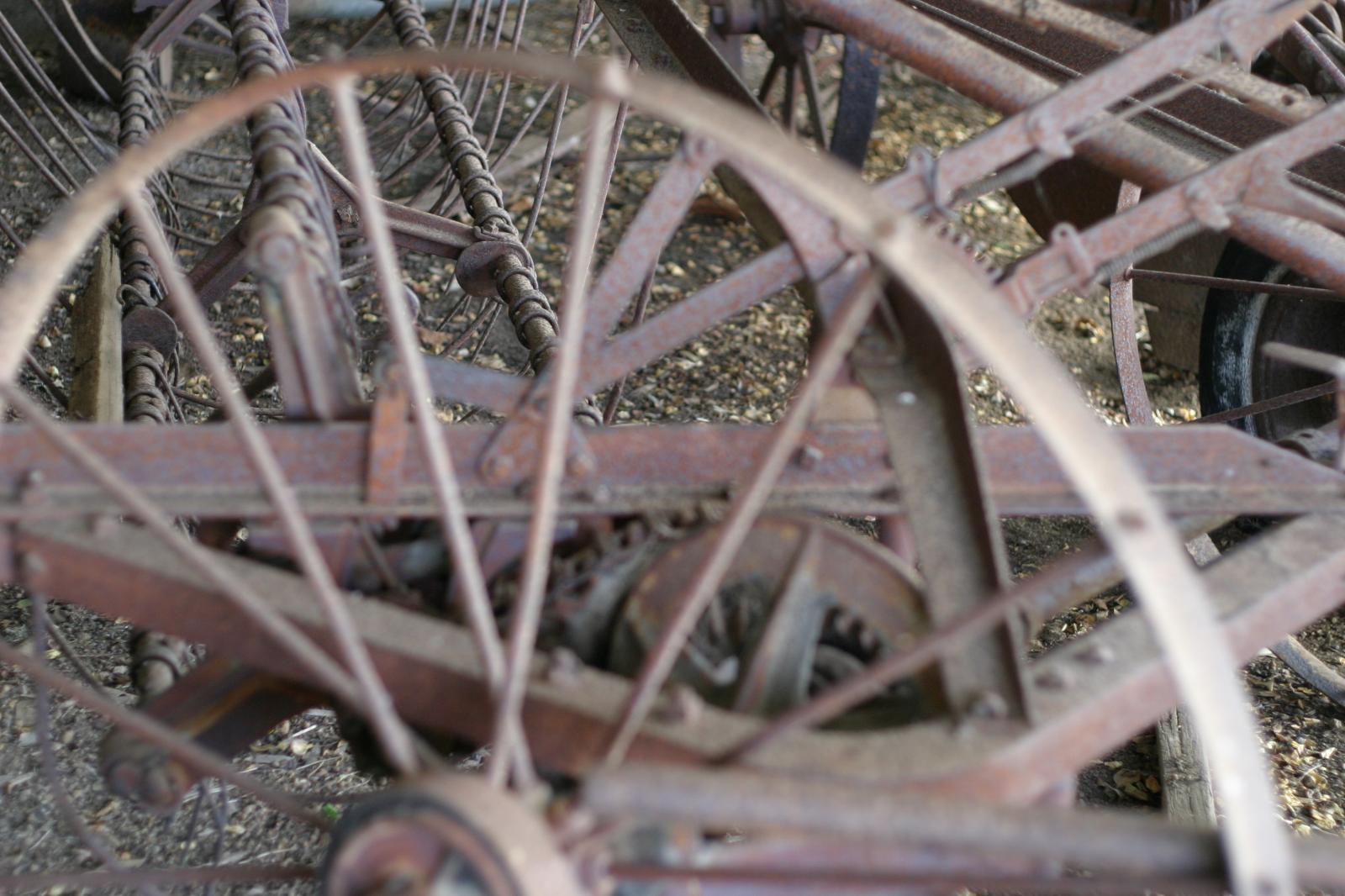
Antique farm machinery, Mount Barker Museum, Western Australia -

-

Raindrop ripples on a pond -

Albany wind-farm against the sunset, Western Australia -

Lorem ipsum dolor sit amet, consectetuer adipiscing elit. Donec mollis. Quisque convallis libero in sapien pharetra tincidunt. Aliquam elit ante, malesuada id, tempor eu, gravida id, odio. Maecenas suscipit, risus et eleifend imperdiet, nisi orci ullamcorper massa, et adipiscing orci velit quis magna. -
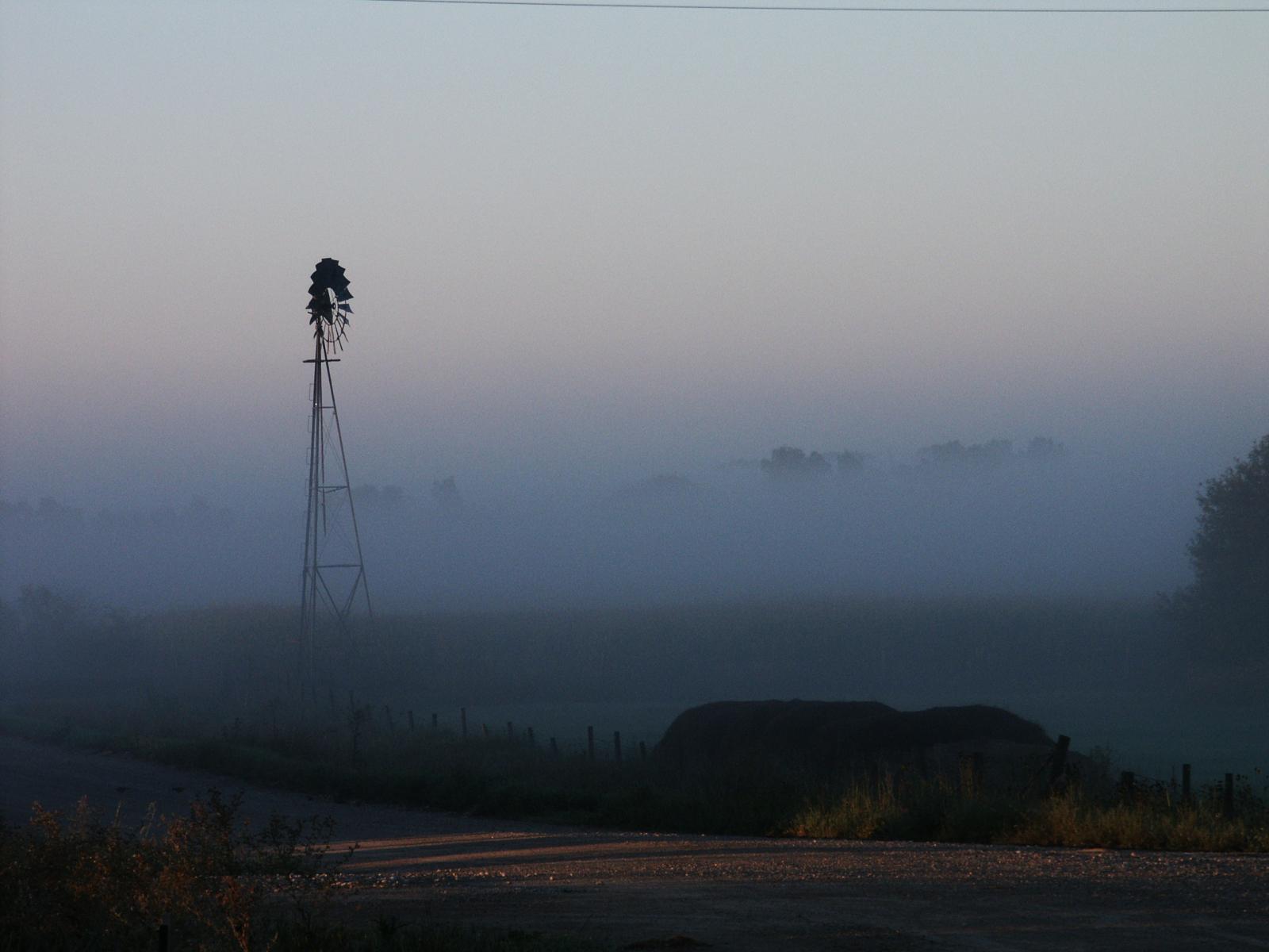
Windmill shrouded in fog at a farm outside of Walker, Iowa -

Jericoacoara Ceara Brasil -

Sunrise over the coast in Huatulco, Oaxaca, Mexico
Seven columns: how does this look on a narrow window?
-

-

-

-

-

It’s dangerous to go alone! Take this. -

-

-

-

-

Boat BW PB Barco Texture Beautiful Fishing -

Coastline in Huatulco, Oaxaca, Mexico -

Jericoacoara Ceara Brasil -

Sunrise over the coast in Huatulco, Oaxaca, Mexico -

Beach at Big Sur, CA -

Windmill shrouded in fog at a farm outside of Walker, Iowa -

Sea and rocks, Plimmerton, New Zealand -

Rusty rails with fishplate, Kojonup
Eight columns:
-

Lorem ipsum dolor sit amet, consectetuer adipiscing elit. Donec mollis. Quisque convallis libero in sapien pharetra tincidunt. Aliquam elit ante, malesuada id, tempor eu, gravida id, odio. Maecenas suscipit, risus et eleifend imperdiet, nisi orci ullamcorper massa, et adipiscing orci velit quis magna. -

Boardwalk at Westport, WA -

Golden Gate Bridge -

Antique farm machinery, Mount Barker Museum, Western Australia -

Orange Iris -

Albany wind-farm against the sunset, Western Australia -

Bell on wharf in San Francisco -

Sydney Harbor Bridge -

-

Raindrop ripples on a pond -

-

-

Boat BW PB Barco Texture Beautiful Fishing -

-

Boats and reflections, Royal Perth Yacht Club -

Rusty rails with fishplate, Kojonup -

Sea and rocks, Plimmerton, New Zealand -

Coastline in Huatulco, Oaxaca, Mexico -

-

Block: Columns
This page tests how the theme displays the columns block. The first block tests a two column block with paragraphs.
This is the second column. It should align next to the first column. Reduce the browser window width to test the responsiveness.
This is the second column block. It has 3 columns.
Paragraph 2 is in the middle.
Paragraph 3 is in the last column.
The third column block has 4 columns. Make sure that all the text is visible and that it is not cut off.
Now the columns are getting narrower.
The margins between the columns should be wide enough,
so that the content of the columns does not run into or overlap each other.
Column one.
Column two.
Column three.
Column four.
Column five.
To change the number of columns, select the column block to open the settings panel. You can show up to 6 columns. If the theme has support for wide align, you can also set the alignments to wide and full width.
Below is a column block with six columns, and no alignment:
Column one.
Column two.
Column three.
Column four.
Column five.
Column six.
Next is a 3 column block, with a wide alignment:
Column one.
Column two.
Column three.
And here is a two column block with full width, and a longer text. Make sure that the text wraps correctly.
This is column one. Sometimes, you may want to use columns to display a larger text, so, lets add some more words. Lorem ipsum dolor sit amet, consectetuer adipiscing elit. Donec mollis. Quisque convallis libero in sapien pharetra tincidunt. Aliquam elit ante, malesuada id, tempor eu, gravida id, odio. Maecenas suscipit, risus et eleifend imperdiet, nisi orci ullamcorper massa, et adipiscing orci velit quis magna. Praesent sit amet ligula id orci venenatis auctor. Phasellus porttitor, metus non tincidunt dapibus, orci pede pretium neque, sit amet adipiscing ipsum lectus et libero. Aenean bibendum. Curabitur mattis quam id urna. Vivamus dui. Donec nonummy lacinia lorem. Cras risus arcu, sodales ac, ultrices ac, mollis quis, justo. Sed a libero. Quisque risus erat, posuere at, tristique non, lacinia quis, eros.
Column two. Cras volutpat, lacus quis semper pharetra, nisi enim dignissim est, et sollicitudin quam ipsum vel mi. Sed commodo urna ac urna. Nullam eu tortor. Curabitur sodales scelerisque magna. Donec ultricies tristique pede. Nullam libero. Nam sollicitudin felis vel metus. Nullam posuere molestie metus. Nullam molestie, nunc id suscipit rhoncus, felis mi vulputate lacus, a ultrices tortor dolor eget augue. Aenean ultricies felis ut turpis. Lorem ipsum dolor sit amet, consectetuer adipiscing elit. Suspendisse placerat tellus ac nulla. Proin adipiscing sem ac risus. Maecenas nisi. Cras semper.
We can also add blocks inside columns:
- This is a numbered list,
- inside a 3 column block
- with a wide alignment.
The middle column has a paragraph with an image block below.

-This third column has a quote
Theme Reviewer
But wait there is more! We also have a block called Media & Text, which is a two column block that helps you display media and text content next to each other, without having to first setup a column block:

Media & Text
A paragraph block sits ready to be used, below your headline.
Block: Quote
The quote block has two styles, regular:
Gutenberg is more than an editor.
The Gutenberg Team
and large:
Yes, it is a press, certainly, but a press from which shall flow in inexhaustible streams, the most abundant and most marvelous liquor that has ever flowed to relieve the thirst of men!
Johannes Gutenberg
The quote blocks themselves have no alignments but the text can be aligned, bold, italic, and linked:
Theme Review
In addition to the quote block, we also have the pull quote, with a regular and a solid color style.
You can change the color of the border and the text with the regular style:
In addition to the quote block, we also have the pull quote.
Theme Reviewer
Or change the background color and text color with the solid color style:
a solid color style
Theme Reviewer
Block category: Common
The Common category includes the following blocks: Paragraph, image, headings, list, gallery, quote, audio, cover, video.
The paragraph block is the default block type. It should not have any alignment of any kind. It should just flow like you would normally expect. Nothing fancy. Just straight up text, free flowing, with love.
This paragraph is left aligned.
This italic paragraph is right aligned.
Neither of these paragraphs care about politics, but this one is bold, medium sized and has a drop cap.
This paragraph is centered.
This paragraph prefers Jazz over Justin Timberlake. It also uses the small font size.
This paragraph has something important to say: It has a large font size, which defaults to 36px.
The huge text size defaults to 46px, but the size can be customized.
This paragraph is colorful, with a red background and white text (maybe). Colored blocks should have a high enough contrast, so that the text is readable.
Below this block, you will see a single image with a circle mask applied.

H1 Heading
H2 Heading
H3 Heading
H4 Heading
H5 Heading
H6 Heading
Ordered list
- The software should be licensed under the GNU Public License.
- The software should be freely available to anyone to use for any purpose, and without permission.
- The software should be open to modifications.
- Any modifications should be freely distributable at no cost and without permission from its creators.
- The software should provide a framework for translation to make it globally accessible to speakers of all languages.
- The software should provide a framework for extensions so modifications and enhancements can be made without modifying core code
Unordered list
- One
- Two
- Three
- Four
- Five
-

Jericoacoara Ceara Brasil -

Sunrise over the coast in Huatulco, Oaxaca, Mexico -

Windmill shrouded in fog at a farm outside of Walker, Iowa -

Coastline in Huatulco, Oaxaca, Mexico -

-

Beach at Big Sur, CA
Quote
Cite
Cover block with background image
The file block has a setting that lets us show or hide a download button with editable text:
Video blocks have settings for showing and hiding the playback controls. Use autoplay and playback controls responsibly.
The video block below is muted and has a poster image that displays before the video starts:
Block category: Embeds
This post tests various embed blocks:
Block category: Widgets
The shortcode widget:
The Archive Widget:
The same Archive widget but as a dropdown:
The Category widget block has an additional option for showing category hierarchies:
The Latest Comments widget can display or hide the avatars, the date, and the comment excerpt:
Here is an example of the Comments widget with all the options disabled. The number of comments has been reduced to two.
And here is the Latest Posts widget in the list view, with dates:
Grid view, now sorted from A -Z.
You can also change the number of columns used to display the latest posts. The block below only displays posts from the Block category:
Search widget:
Tag Cloud widget:
RSS Feed widget:
Block category: Layout Elements
The Layout Elements category includes the following blocks: Group, Button, Columns, Media & Text, separator, spacer, read more, and page break.
This group block has a light green background color.
The read more block should be right below this text, but only on list pages of themes that show the full content. It won't show on the single page or on themes showing excerpts.


